
Project Overview
Bands in Town is an application that is supposed to notify users when their favorite muscial artists and bands are playing shows in their cities, so that fans can make sure they don't miss out on shows and artists they like. With such a simple premise, I decided to come up with a task list to test users' opinions and feelings about the onboarding process to assess the effectiveness of the app when first encountered by a potential user.
Task List
I wanted to keep the list simple but still get key feedback about Bands in Town's process. Therefore, I instructed users to:
1. Locate and download the app in the app store
2. Launch the app
3. Register for the app as a new user
4. Utilize the app to find one band they liked
User Responses
Onboarding Screens with Annotated Callouts


Into Screen:
- App logo doesn't communicate meaning or purpose of the app.
- Image is unfocused and isn't pertinent to any kind of notification service.
- Value proposition isn't relevant to app function.


Login Screen:
- E-mail login is simple, but the user doesn't know what they are really logging in for.
- Opportuity to allow additional simple login formats (Twitter, Instagram).


Login Confirmation Screens:
- E-mail confirmation is direct and simple.


Music selection login:
- No value is delivered before user is asked question of significant cognitive load
- User isn't really sure what the app fully does, so there is hesitancy before wanting to grant any additional permissions besides e-mail.
- Onboarding process is lengthened both in work for the user and time consumed.


Contact pages:
- User is prompted to connect personal contacts which deliver no value to the app function
- Without any feeling of reliability, user doesn't have much motivation to trust the app with personal contacts.
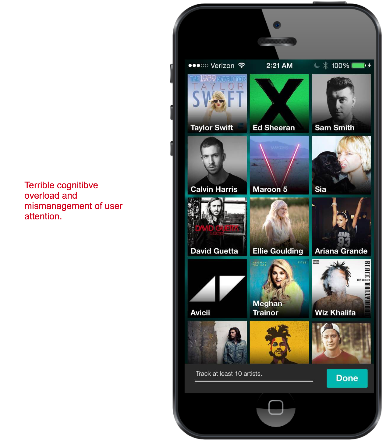
- Annoying notification about tracking "at least 10 artists" to start rather than letting user increase functionality later.
- Value and role of the app is still delayed.

A few key features of the new home page:
- Final screens are information overload and don't manage user's preferences in a logical way
- While there are allusions to "artist tracking", there is still not an effective screen detailing the role of the app: to notify a user when an artist s/he likes is performing in close geographic proximity.
- No sense of information architecture or navigation flow.
Test Observations & Suggestions
Observations:
•Users were frequently unsure of what exactly the app would allow them to do.
•The length onboarding process grew tedious and testers wanted to quit because they didn't see the value.
•Some of the onboarding procedures seemed bloated and extraneous to the nature of the product.
•Users didn't want to give up their login and contact information when they weren't even sure of the app's value.
•Extreme cognitive overload in the end of onboarding did not result in positive or enthusiastic feelings as the process finally finished.
Suggestions:
•Clear value proposition
•Reduce bloating of the onboarding and allow a simple credential sign in
•Change the branding so there is a clearer representation of the app's purpose.
•Eliminate overwhelming cognitive load screens at the end of onboarding and present a guided, simple tutorial on using the app.