
I wanted to create a user interface (UI) kit representing a personalized design aesthetic.
Next, I used the kit to redesign a tax form.
Fonts & Sizing

Eveleth Slant - "Nicholas Reis" text - I chose this font at a regular weight and a size of 85. For the largest font in the kit and likely on the screen, I needed to ensure that it would both very visible, functional, but also intriguing and eye-catching. Eveleth Slant is free of any distracting serifs or ornamentations, and is quickly readable from both a distance and a quick glance. Additionally, I liked that upon a closer look, the type contains subtle decorum on the letters themselves - this detail speaks to me as having an extra sense of design refinement.
Apple Gothic - Still easily read and noticed, the Apple Gothic heading is both complimentary to the Eveleth selection but also a contrast to the filled and block-lettered Eveleth face. The rounded, thin characters are a perfect foil to the thicker Eveleth typeface. Additionally, the grey coloring is a few shades away from the background, presenting an additional chance to contrast the white Eveleth effectively to promote visual hierarchy.
Iconography
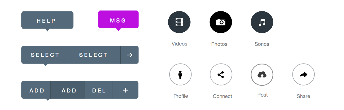
Iconography - I wanted to select simple, high-contrast icons that communicated effectively while keeping with my design aesthetic. Additionally, they each have a label below to help reduce any confusion.
Tags and Notifications
Notification Styles - The notification styling I chose for the kit are straightforward and effective- they emphasize an understated, solid presence with a fully capitalized Helvetica-Neue font in white. The goal of the buttons is to communicate an ability to serve a fuction while adding to the mood and overall design of the page, and the rectangular shape is both unobtrusive and discoverable.
Buttons & Color

Navy Blue Buttons - Navy blue is a bold, direct color for buttons identifying key points and features of the interface.
Teal Buttons - The teal buttons are for secondary, additive functionalities often branching off of the main features from the Navy buttons. The teal color denotes an aligned but less prominent feature.
Gray/White Buttons - These colors are mostly for fixed, constant interface features that mostly stay onscreen.
Magenta Buttons - I chose the magenta color as an instant "attention-magnet" - when there is an especially urgent need or area requiring user-focus, the magenta color pops out apart from all the other interface colors.
Button Shapes - Buttons can be rounded, rectangular, or arrow-shaped. This can be customized for both aesthetic and hierarchial aesthetic choices.
Headings - I incorporated a Helvetica Neue style to create subtly scaled font headings - each heading size can be logically scaled to inform the viewer about site architecture and hierarchy.
Photos & Body Text

Photography - I designed this UI kit to work well with beautiful, high resolution photographs. The muted backgrounds and subtle tones used through much of the interface were chosen with this in mind.
Body Text Style - Helvetica Neue is a stylish, readable choice that allows the user to engage with content in a seamless and logical manner. The style flows with the Apple Gothic and Eveleth choices, emphasizing clarity and simplicity.
Navigation
Navigation Iconography - Clear, direct navigation is integral to a great interface. These icons are simple and effective - and fit the interface styling.
Alternate Heading Styles
Alternate Heading Style - While the white over the gray headlines are engaging and useful - the inverted gray over the white backdrop can also be sampled for headlines as a supplementary design.
Progress Bars, Input Fields, and Hover States
Status Indicators and Progress Bars -The kit includes a variety of visual tools to indicate positioning and approximation. To match the rest of the kit's color scheme, I chose colors corresponding to other kit elements. This allows for a smooth positioning and alignment of the bars with unique interface designs and minimizes cognitive load on the user.
Input Fields -Simplicity is paramount in the input fields. Depending on what is entered, the kit presents options to highlight a selected field and to also call attention to any incorrect or invalid field via border colors. The gray prompt appearing in the input-space compliments the gray found throughout the rest of the kit.
Tags and Hover States - Tags are easily identifiable, draw user attention, and like other elements are colored in correspondence to the rest of the kit. Hover states are displayed in an attractive gradient - this will not overwhelm the user's attention but will provide a subtle enough variation to allow user differentiation.
Mobile Templates


Photographic Backgrounds - Interface can be themed with customizable backgrounds, adding character and importance to a particular interface.
Whitespace- A useful amount of whitespace is key in preserving a functional, uncluttered look on the small mobile screen.
Legibility - The Helvetica-Neue font is elegant but also extremely functional and practical for all tiers of heading on the interface.
Muted Color Palatte- I desired the ability to subtly variate - the various shades of grey and the white and black reversible fonts and backgrounds allows for a lot of customization while maintaining a focus in color choice.
Visual Hierarchy -Colums, font-styling, and placement all serve to promote a strong visual hierarchy in the mobile platform.
Gallery View-The primacy of images is emphasized with the ability to closely position pictures - this focuses attention of the user while maximizing the use of available screen space.
Redesign of US Tax Form 1099


Designing the New 1099
USER LOGIN
Visitors are welcomed to the introductory 1099 screen by a clear headline displaying the form title. Additional information about form particulars is displayed below, with login information prominently centered.
A few key features of the new login screen:
- Simple and effective heading imparts the type and purpose of the form.
- User is identified by e-mail for login questions, but additional and unnecessary inqueries are avoided.
- Form blanks are clickable and user is prompted at each space.
- Hover state gradient shows when a button has been selected to enrich interface textures.
- Progress bar at the top of the form clearly shows user progress and positioning.
PAYER INFO
Users at the "Payer info" section are presented with a strikingly different configuration than what was previously presented on the 1099. Starting with the colors and layout, the experience has been streamlined to be as efficient as possible.
Here are a few new details about the new "payer info" section:.
- Radiant, effective color scheme guides users to make informed and appropriate decisions.
- Magenta attracts the user to move forward in the form while gray and blue colors allow for focused user attention.
- Chunking of appropriate form elements reduces user confusion and increases speed .
- When applicable, numbering of sections is far more legible and flows in a more cohesive manner than before.
- Throughout form, input-field borders are color coded to denote selection and increase user focus.
RECIPIENT INFO
The recipient category has also been adjusted to improve user attention and accuracy. Now, the user can focus on a distinction between payer and recipient as information is entered.
A few key features of the new recipient page:
- Vital details have been separated from one form section to each have their own sections, increasing readability and user speed.
- Consistent color scheme and form structure reduces user confusion and builds confidence.
- Form fields are evenly spaced and grouped for ideal user understanding .
FINISH
Throughout the form, the clear restructuring of the fields guides users to enter applicable information more accurately and with more confidence than ever before. The carefully chosen colors and type assist in defining the fields as readable and helpful. Finally, at the last screen , a screen is dedicated to confirming a submitted form, assuring the user of form completion.
OLD 1099 FORM
The standard 1099 form is a study in misguided and ineffective form design.
Some notable shortcomings of the old form:
- Black-and-white color scheme is easily glossed over, failing to hold or guide the user's attention.
- Form has no visual hierarchy - existing numbers on form seem arbitrarily placed.
- Form has minimal typographical variation, contributing to a dominant element of "sameness" between fields.
- Form chunks many differnet data pieces together in a single field, contributing to user confusion and slowing efficiency.
- Many vitally important fields seem tucked away and lack any typographical distinctinon or color selection.
.